

Labkom99.com – Mouseover zoom dan membuat efek thumbnail menggunakan css3 sehingga menghasilkan zoom in dan efek bayangan pada gambar. Ketika mouse melayang di atas gambar bagian tengah gambar diperbesar di tempat asalnya dan kemudian ada layer ditampilkan disekitar gambar.
Dalam tutorial ini kita akan belajar bagaimana memanfaatkan CSS3 dengan cara yang sangat sederhana. Kami akan membuat efek hover thumbnail dengan transisi CSS3. Saat mengarahkan kursor ke gambar akan menampilkan deskripsi gambar dan memperbesar gambar.
Belajar HTML Dan CSS3 Dengan Tema Lain.
- Belajar HTML5 Dan Canvas Membuat Efek Animasi Hue Ball Berbagai Warna
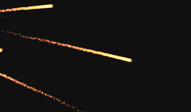
- Belajar HTML5 Dan Canvas Membuat Bola Api Luncur
- Belajar HTML Dan CSS Membuat Menu Navigasi Horizontal
- Belajar HTML Membuat Paragraf
- Belajar HTML5 dan Canvas Membuat Animasi Lingkaran
- Belajar HTML + CSS: Membuat Berbagai Bentuk ” Shape ” Dengan HTML dan CSS3
- Belajar HTML + CSS: Penggunaan Dan Penjelasan Element CSS Float
- Membuat Kolom Layout Template HTML CSS + DIV
Berikut adalah surce code Dengan menggunakan HTML dan CSS3
HTML Membuat Efek Thumbnail
Struktur HTML sangat sederhana dan intuitif ini adalah tempat dimana gambar dan informasi lain berada. Di dalam tampilan masukkan elemen dengan kelas yang membuat efek dengan CSS3 dan di dalamnya ada judul, deskripsi dan tautan ke gambar penuh.
<div class="container">
    <div class="row">
        <div class="col-md-4 col-sm-6">
            <div class="box">
                <img src="images/img-1.jpg">
                <div class="box-content">
                    <h3 class="title">Nama Gambar</h3>
                    <span class="post">Keterangan Gambar</span>
                </div>
                <ul class="icon">
                    <li><a href="#"><i class="fa fa-search"></i></a></li>
                    <li><a href="#"><i class="fa fa-link"></i></a></li>
                </ul>
            </div>
        </div>
        <div class="col-md-4 col-sm-6">
            <div class="box">
                <img src="images/img-2.jpg">
                <div class="box-content">
                    <h3 class="title">Nama Gambar</h3>
                    <span class="post">Keterangan Gambar</span>
                </div>
                <ul class="icon">
                    <li><a href="#"><i class="fa fa-search"></i></a></li>
                    <li><a href="#"><i class="fa fa-link"></i></a></li>
                </ul>
            </div>
        </div>
    </div>
</div>
CSS Efek Thumbnail
Setelah membuat HTML selanjutnya mengatur CSSnya dan menambahkan kelas khusus dengan gaya efek yang diinginkan.
.box{
    font-family: 'Kanit', sans-serif;
    text-align: center;
    border: 10px solid #fff;
    box-shadow: 1px 1px 2px #e6e6e6;
    overflow: hidden;
    position: relative;
}
.box:hover{ box-shadow: 13px 13px 15px rgba(0, 0, 0, 0.3); }
.box:before{
    content: "";
    background: linear-gradient(to left top,#11998e,#38ef7d);
    height: 100%;
    width: 100%;
    opacity: 0;
    position: absolute;
    left: 0;
    top: 0;
    transition: all 0.4s linear;
}
.box:hover:before{ opacity: 1; }
.box img{
    width: 100%;
    height: auto;
    transition: all 0.4s linear;
}
.box:hover img{
    opacity: 0;
    transform: scale(3);
}
.box .box-content{
    color: #fff;
    width: 100%;
    transform: translateY(-50%) scale(0);
    position: absolute;
    top: 50%;
    left: 0;
    transition: all 0.4s linear;
}
.box:hover .box-content{ transform: translateY(-50%) scale(1); }
.box .title{
    font-size: 25px;
    font-weight: 600;
    letter-spacing: 1px;
    text-transform: uppercase;
    margin: 0;
}
.box .post{
    font-size: 16px;
    text-transform: capitalize;
}
.box .icon{
    padding: 0;
    margin: 0;
    list-style: none;
    position: absolute;
    right: 8px;
    bottom: 10px;
}
.box .icon li{
    display: inline-block;
    margin: 0 1px;
    opacity: 0;
    transform: scale(1.3);
    transition: all 0.3s ease 0.4s;
}
.box:hover .icon li{
    opacity: 1;
    transform: scale(1);
}
.box:hover .icon li:nth-child(2){ transition: all 0.3s ease 0.2s; }
.box .icon li a{
    color: #11998e;
    background: #fff;
    font-size: 16px;
    line-height: 33px;
    height: 33px;
    width: 33px;
    border-radius: 50%;
    display: block;
    transition: all 0.5s ease;
}
.box .icon li  a:hover{
    color: #fff;
    background-color: #11998e;
    box-shadow: 0 0 5px #000;
}
@media only screen and (max-width:990px){
    .box { margin: 0 0 30px; }
}
Source Code Lengkapnya
<html>
<style>
    .box{
    font-family: 'Kanit', sans-serif;
    text-align: center;
    border: 10px solid #fff;
    box-shadow: 1px 1px 2px #e6e6e6;
    overflow: hidden;
    position: relative;
}
.box:hover{ box-shadow: 13px 13px 15px rgba(0, 0, 0, 0.3); }
.box:before{
    content: "";
    background: linear-gradient(to left top,#11998e,#38ef7d);
    height: 100%;
    width: 100%;
    opacity: 0;
    position: absolute;
    left: 0;
    top: 0;
    transition: all 0.4s linear;
}
.box:hover:before{ opacity: 1; }
.box img{
    width: 100%;
    height: auto;
    transition: all 0.4s linear;
}
.box:hover img{
    opacity: 0;
    transform: scale(3);
}
.box .box-content{
    color: #fff;
    width: 100%;
    transform: translateY(-50%) scale(0);
    position: absolute;
    top: 50%;
    left: 0;
    transition: all 0.4s linear;
}
.box:hover .box-content{ transform: translateY(-50%) scale(1); }
.box .title{
    font-size: 25px;
    font-weight: 600;
    letter-spacing: 1px;
    text-transform: uppercase;
    margin: 0;
}
.box .post{
    font-size: 16px;
    text-transform: capitalize;
}
.box .icon{
    padding: 0;
    margin: 0;
    list-style: none;
    position: absolute;
    right: 8px;
    bottom: 10px;
}
.box .icon li{
    display: inline-block;
    margin: 0 1px;
    opacity: 0;
    transform: scale(1.3);
    transition: all 0.3s ease 0.4s;
}
.box:hover .icon li{
    opacity: 1;
    transform: scale(1);
}
.box:hover .icon li:nth-child(2){ transition: all 0.3s ease 0.2s; }
.box .icon li a{
    color: #11998e;
    background: #fff;
    font-size: 16px;
    line-height: 33px;
    height: 33px;
    width: 33px;
    border-radius: 50%;
    display: block;
    transition: all 0.5s ease;
}
.box .icon li  a:hover{
    color: #fff;
    background-color: #11998e;
    box-shadow: 0 0 5px #000;
}
@media only screen and (max-width:990px){
    .box { margin: 0 0 30px; }
}
    </style>
<body>
<div class="container">
<div class="row">
<div class="col-md-4 col-sm-6">
<div class="box">
<img src="https://1.bp.blogspot.com/-dIPSN5LDAhQ/XoQHrzDLI6I/AAAAAAAAJsc/gFD8Pw-kIFUTzSpfEirlePnVwpfFzLjagCLcBGAsYHQ/s640/Belajar%2BHTML5%2BDan%2BCanvas%2BMemembuat%2BEfek%2BAnimasi%2BHue%2BBall%2BBerbagai%2BWarna.png" />
<div class="box-content">
<h3 class="title">
LABKOM99</h3>
<span class="post">Web Designer</span>
</div>
<ul class="icon">
<li><a href="https://labkom99.com"><i class="fa fa-search"></i></a></li>
<li><a href="https://labkom99.com"><i class="fa fa-link"></i></a></li>
</ul>
</div>
</div>
<div class="col-md-4 col-sm-6">
<div class="box">
<img src="https://1.bp.blogspot.com/-V0WYwuqmsYE/XoM3fVlEwCI/AAAAAAAAJsM/PVRpq4PsADwd747gKqYnHPDkXVhXjjD7gCLcBGAsYHQ/s640/Belajar%2BHTML5%2BDan%2BCanvas%2BMembuat%2BBola%2BApi%2BLuncur.png" />
<div class="box-content">
<h3 class="title">
LABKOM99</h3>
<span class="post">Web Developer</span>
</div>
<ul class="icon">
<li><a href="https://labkom99.com"><i class="fa fa-search"></i></a></li>
<li><a href="https://labkom99.com"><i class="fa fa-link"></i></a></li>
</ul>
</div>
</div>
</div>
</div>
</body>
</html>
Demo :